AAE presents new Further Confusion logo by Helvetica
Posted by GreenReaper (Laurence Parry) on Sun 18 Aug 2013 - 21:42 — Edited as of Wed 18 Jun 2014 - 18:04
 Results have been announced in Anthropomorphic Arts and Education's trademark logo competition.
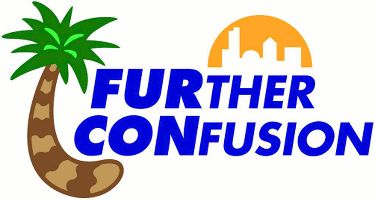
Helvetica Bold (Foofers), creator of the winning design (later modified), will receive a patron-level membership for Further Confusion 2014 and promotional items.
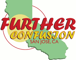
Runners-up Latte Koffeefox, GreenReaper, bcokami, Floe, and I.M. Weasel get a sponsor registration and will be featured in the con-book.
All 33 entries were anonymized and identified as numbers through the board's selection process.
Published runner-up designs
Other entries: Avanto - CanineHybrid - Dax Wildsong - Kayze - KristoWolf

About the author
GreenReaper (Laurence Parry) — read stories — contact (login required)a developer, editor and Kai Norn from London, United Kingdom, interested in wikis and computers
Small fuzzy creature who likes cheese & carrots. Founder of WikiFur, lead admin of Inkbunny, and Editor-in-Chief of Flayrah.


Comments
You're a bit obsessed with light blue and white color schemes Green. lol.
I did present various colour alternatives. Also, they chose a blue and white logo!
Ugh, these are all a graphic designer's nightmare... besides Reaper's. Nice work there, sorry they didn't select that one actually. Instead they went for something with a bad curved typography. It looks like a ASPCA logo hybrid with an Epcot logo. Not quite sure if it makes me want to go to Disney world, or adopt a cat. It for sure doesn't make me think of furry conventions.
The term "Fur Con" is quickly becoming like "Xerox".
Editor's note: Since this comment was made, I've added the remaining two runners-up and three more other entries.
I suspect that's all we'll see, but if I spot any more entries popping up, I'll add them.
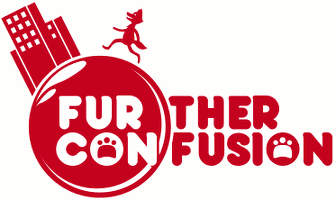
The one by Floe looks too much like an earthquake-radius chart, and the one by Brian James Collazo looks like a bomb about to explode. They are both attractive, but carry negative subliminal suggestions.
Fred Patten
Yeah, the composition overall felt like it needed something, and I figured a second circular element would help. You're right about the radius thing. Sorry you feel they're "graphic designer nightmares", some of us just aren't logo people and wanted to give it a shot, and comments like this are just on the edge between constructive / somewhat disappointing.
Your last comment about bomb/earthquake radius was correct and well put, but please do try to be sensitive to how this might be some peoples' first time submitting such a thing (Not mine, I've no excuse!)
If it makes you feel a little better the "nightmare" comment was made before your's and brian's were added.
Even still, that's wicked rude to say about other people :c
Well, welcome to the Internet!
True that I mean it's all good; everyone is entitled to their own opinion :) from nice to blunt doesn't matter to me really but we can all agree on is this~
"opinions are like farts, So hard to hold em in. When one slips, everyone's gonna know it and at least one person is gonna leave the room."
Readers might also consider that the expected benefit does not justify significant investment.
As half of the Sponsor/Patron registration is a donation, the total value of the prizes was around $350-400; any one person could only get from $50 to $100 out of it, plus intangibles such as being mentioned in the conbook (and here).
Considering the time necessary to learn about the contest, it's unreasonable to expect contest entries to represent more than a few hours of effort. (That time goes quickly; I spent almost thirty minutes just to determine a good font.)
To Fred: You know what it actually does, thanks for the feedback! A picture is worth a 1000 words I always say but no it wasn't meant for that although there is an actually meaning for it :)
To GreenReaper: Can you change my submission name from my actual name (brian) to bcokami? If you can, that'd be cool!
Sure. I used that name because it was what FC posted - it took a while to track you down on FA! :-)
Thank you!~
I just hope they don't use my real name in the actual con book *laughs*
I was thinking to mention that, but I figured since they changed it on the site, it should filter through.
(Might be best to check with them, though . . . just in case.)
Shit, these comments are by two different people. I apologize. I just got off of a hell shift and I'm woozy.
Sorry Floe. I was never taught to be "sensitive". I was taught to be honest and blunt in critiques. It helps others see what people do not like and better themselves and give them art direction.
I agree that Floe's looks like an earthquake radius map. It's also not a logo that will reproduce well. You have color overlays on the state/text/under text that makes this virtually impossible to flip into various formats. The design needs a bit of work as well. Your earthquake radius lines do not fully encompass the logo. So What you get is your eye rotating around the "UR Con" area. ( Which, text speech isn't my idea of a good logo.) State shape use is tired and old, not very creative.
My advice? Study the work of bauhaus/bauhaus typography. It will teach you a lot.
The bcokami design reminds me of the ads for the movie, " North" http://en.wikipedia.org/wiki/North_(1994_film)
It does look like a bomb however, I agree to that as well. I think that could be defused by perhaps changing the shiny orb appearance to something more earth like.
Makes me wonder why Floe's and Bcokami's logos were not the 2nd and 3rd choice. I honestly would have selected them along with Reapers as my choices out of the lot. Yes, they could use some modifications... but not down right scrap-able like the other two.
The order stated in the story is as on FC's website; however, I have no guarantee that this is a ranking - officially, they are all "runners-up". The order of visual presentation was based on the time they became available, and best-fit.
As announced on the Further Confusion home page on October 15, Helvetica has created a new version of his logo:

Far better in every aspect.
Four years on, and his logo and mine both ended up being used together by a third-party. Vindication!
Now I get to add "published professional graphic designer" to my list of dubious accomplishments. ;-)
Post new comment